
How to build responsive content with the Page Builder
Our page builder allows you to optimise your content for desktop, tablet and smartphone.
Simulate screen sizes

You can easily switch between the different views using the three screen size buttons on the left of the toolbar.
Your changes to the design and block settings (the brush and gear icon on the right of the toolbar) are saved for each screen size. This means that you can, for example, show or hide different blocks for each screen size, adjust the alignment of Flex layout blocks, and so on.
Create responsive layouts
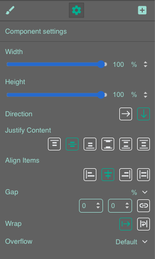
For great responsive content, we recommend using Flex layout blocks. These can be perfectly configured for different screen sizes! To do this, click on a Flex Layout block on your slide and then on the gear icon on the right-hand side of the toolbar.
You can adjust all the settings differently for each of the three screen sizes.
Perfectly fitting images
When you place an image in a Flex Layout block, you have various options for how the image should be adjusted to different screen sizes.
Settings menu (gear icon)
Here you can set the fit as well as alternative text for screen readers.
- None: The image is not fitted into its container, but retains its original size (not recommended for responsive content).
- Fill: The image fills its entire container. This may cause proportional distortion.
- Contain: The image is displayed in its entirety in the container without proportional distortion. Parts of the container may not be filled by the image.
- Cover: The image covers its container completely without proportional distortion. Parts of the image may not be displayed.
- Scale Down: Reduces the image to the smallest version of “none” or “contain.”
Style menu (brush icon)
Adjust the width and height here. We recommend the following combinations:
- Width 100%, Height auto - your image fills the entire width of the Flex block, its height scales proportionally.
- Height 100%, Width auto - your image fills the entire height of the Flex block, its width scales proportionally.