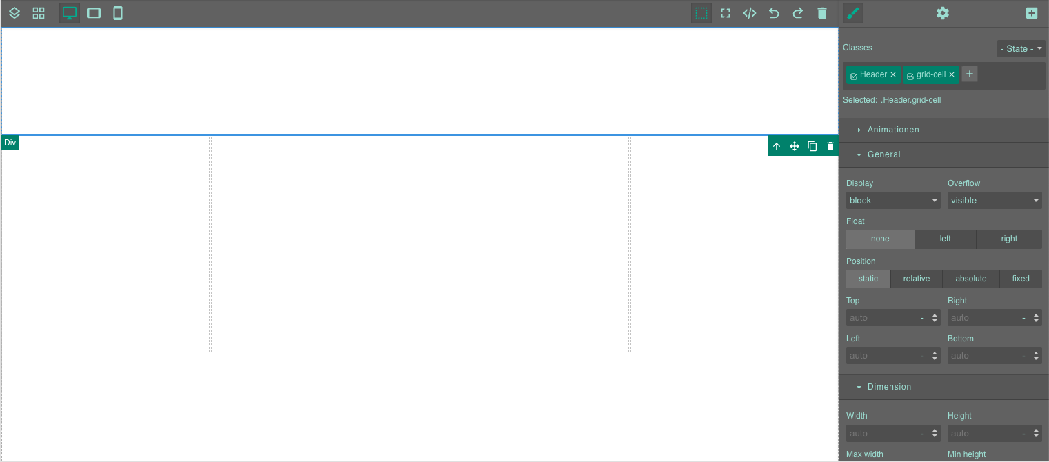
Page Builder: First Steps - Creating a Layout
We recommend that you always start a new Page Builder slide by creating a layout. This ensures that your content is well organized and easily adapts to any screen size.
The Flex Layout
A flex layout is the most flexible solution for responsive content. Simply drag one of the modules from the Layout menu onto your blank slide. You can nest as many Flex modules as you like.
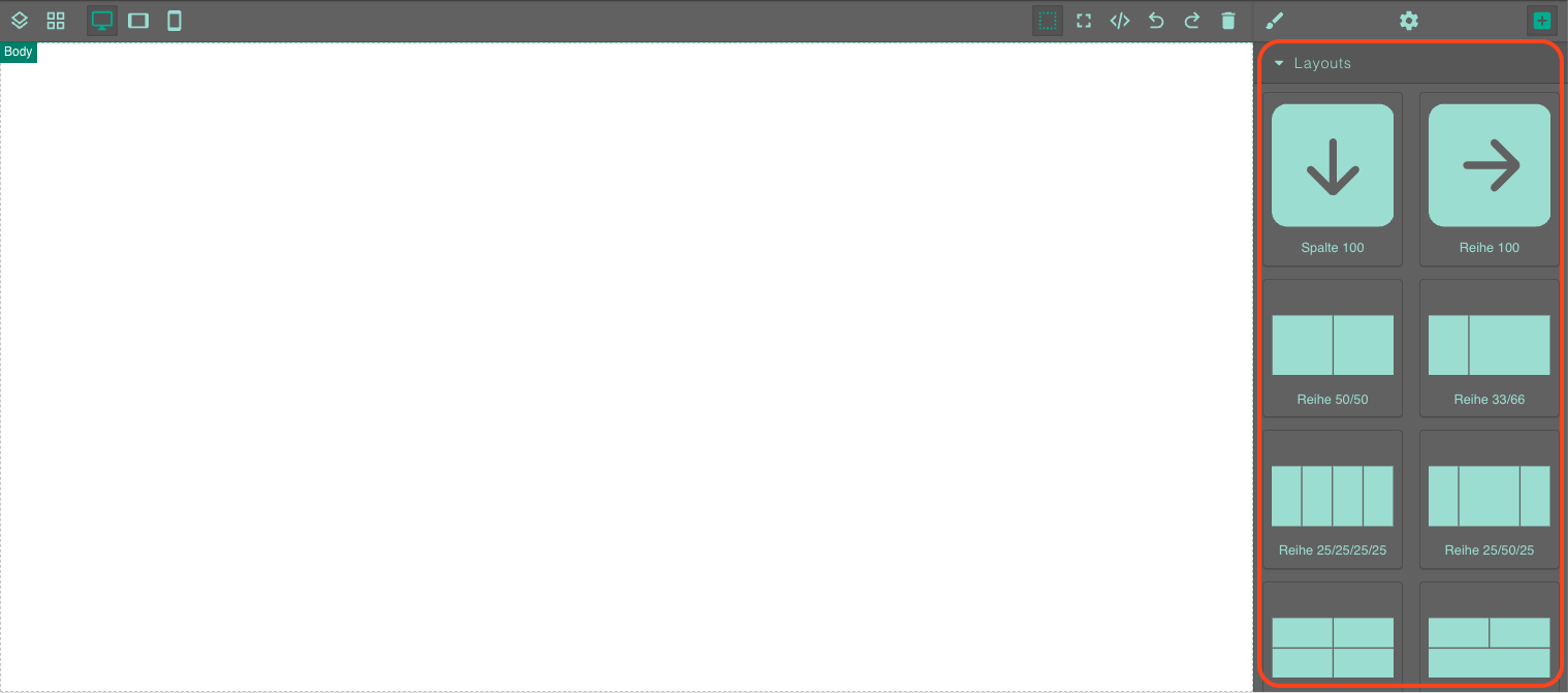
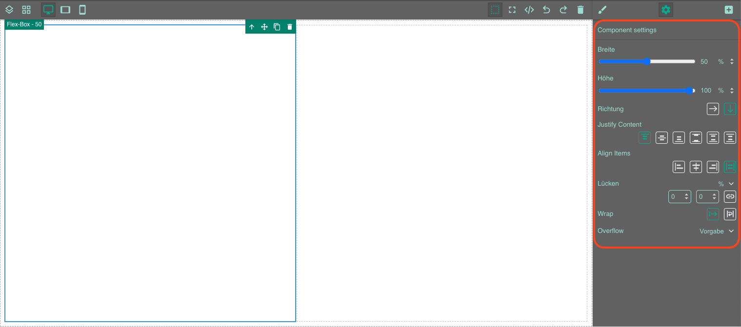
For each Flex module, you can specify whether its content should be shown as a row or a column, the percentage of width and height it should occupy, the alignment of the content, and the type of overflow. Set the overflow to automatic to make the content scrollable when needed.
If you want your Flex modules to appear differently on different screen sizes, you can use the three screen size buttons on the left side of the toolbar. Learn more about responsive content in Page Builder.

The Grid Layout
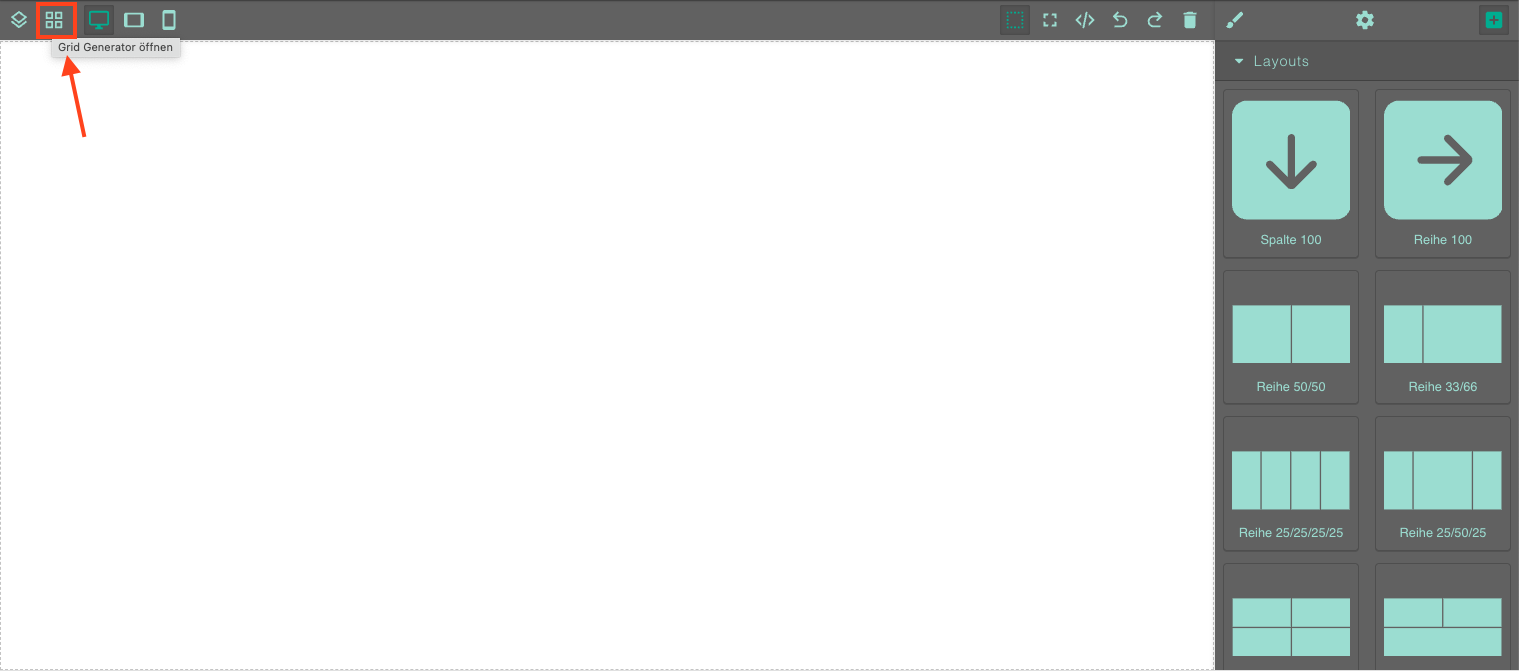
Alternatively, you can create a grid layout using our grid generator. To do this, click on the Grid Generator button on the left side of the toolbar.
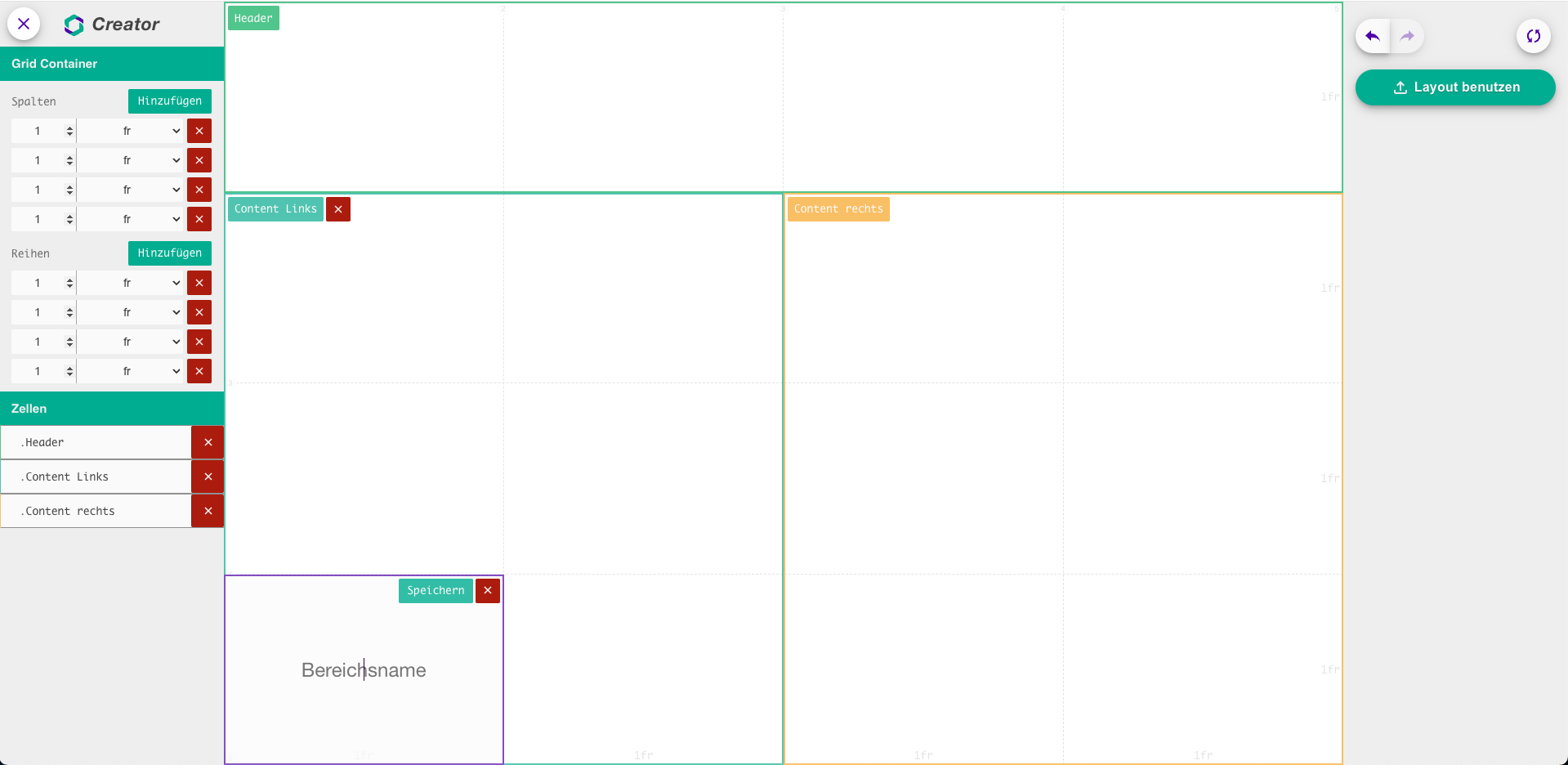
The grid generator allows you to specify how many columns and rows you want your grid to have. You can then select as many cells as you like and link them together to create your own areas within the grid. Give the area a name and click 'Save'.
When you are finished with your layout, click the green 'Apply Layout' button in the top right hand corner of the layout generator.
Now you can fill your layout with content and style it further.